

When you decide to share something on social networks, it is very important that your post gets noticed. One of the ways to make your post stand out in the “sea” of others is visual design . In this text, we will take you step by step through one example of the design process.
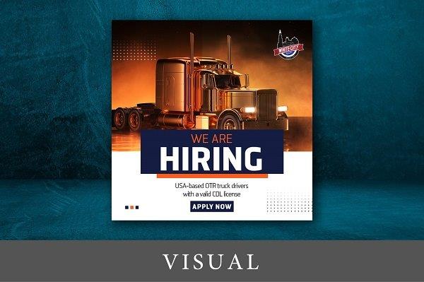
So, before you start you should define what you want to say with the design and what message to convey. This will help you set up a visual hierarchy allowing the user to clearly follow the flow of information.
Once you’ve decided what you want your visual to contain, you could research online how others have designed similar visuals. You can look for inspiration on Facebook , Instagram and Linkedin or on specialized sites such as Pinterest or Canva .
How to design a visual
The first thing you need to do is set the format of your visual. We decided that this visual should be in a 1:1 ratio, i.e. a square shape. And if the dimensions of such a visual are 1080 x 1080 pixels, our recommendation is to use slightly larger dimensions, for example 1200 x 1200px, for the sake of quality.
In our example, what should first attract attention is ” We are HIRING “. For such a text, it is not crucial that it be centralized like here. It is much more important to make it stand out with size, color or shape compared to other elements.
The next step is to select an image. We hope it does not need to be emphasized that the picture should follow the text and explain it more closely. As our post refers to the employment of truck drivers, it is completely understandable that we put a picture of a truck.
If you don’t have already prepared photos, you can certainly look for them on the Internet, where there are a bunch of specialized sites for searching stock images, from which you should select Shutterstock , Adobestock , Freepik , Pexels , Unsplash and others.

After harmonizing the text and the image, it remains to add the logo. Inserting a logo, apart from having a functional role to inform users about which company it is, also has an aesthetic role. Place it so that it stands out enough in relation to the background and surrounding graphic elements, but that it is in the second plan according to the visual hierarchy.
Placing an image, text and logo may be enough for visual design, however, the design may also look too simple, so it would be appropriate to add more graphic elements to enrich the design, as in our case.
That’s why we partially reduced the image in order to open an empty space for more graphic elements, and then we inserted an orange overlay over one part to make it even richer and more interesting.
In order to fill the empty space we created, we inserted part of the text from the ad and the call to action “apply now”, which play an important role in informing potential candidates, but like the logo, they have a significantly lower emphasis in the visual hierarchy.
Finally, as a last step, where the design seems empty and lacks additional graphic elements, you can insert decorations, which in our example are dots and squares. Try to make these final decorations some simple shapes and not too ornate to avoid what is called ” overdesign “.

When designing visuals, it’s always good to think about future posts as well. That’s why it’s a good idea to make an effort to create visuals that you can use more than once. That is, to get a completely different design just by changing the image, font, color or arrangement of graphic elements, and to spend much less time on it.
For more news and interesting stories from digital marketing, visit our blog page or follow our Instagram profile.
Made by Sava Spasić – Senior Graphic Designer @Digitizer
Pročitaj:


